pura • arq
/ Identity for Architecture in its Essential State
Pura Arq. is the repositioning of Pura Arquitetura, a studio with 25 years of experience in high-end residential projects, complete renovations, and corporate spaces. Regina Padilha, the founder of the firm, is also a content creator who leads the Pura Arq. channel and social media, which guided the creation of a clear, educational, and consistent identity across editorial, social, and video formats. The goal of the project was to visually translate the brand’s philosophy: sophistication that arises from the essential, with clarity, precision, and care in every decision.
Challenge
To build a contemporary and original language that communicates rigor and warmth, while preserving the founder’s natural tone and the close relationship the brand has cultivated with its audience over two and a half decades, without relying on ostentatious codes.
Central Idea
Architecture begins with primary forms. Square, triangle, and circle structure spaces, rhythms, and paths. The identity draws from these three units to represent architecture in its purest form, a direct link to the name Pura Arq.
Concept
Essential form becomes place.
The system uses □ △ ○ to generate solids and voids, directions and cuts, modulations and rhythms, scales and layers of information. Few elements, infinite combinations, just like architectural reasoning.
Logotype
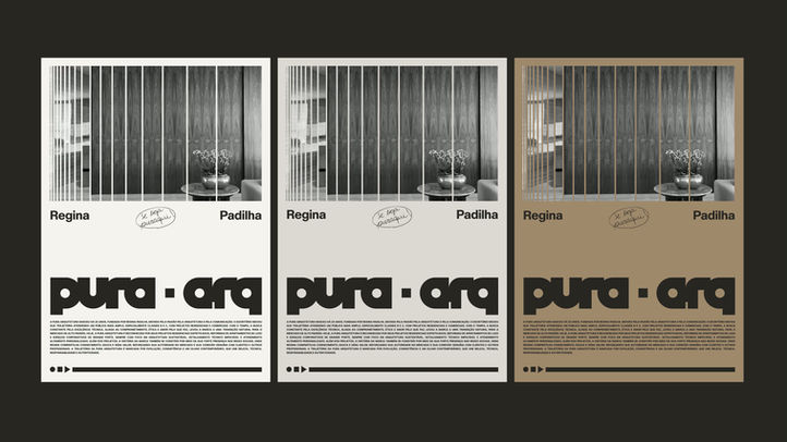
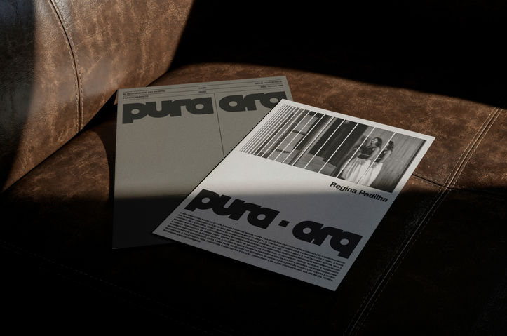
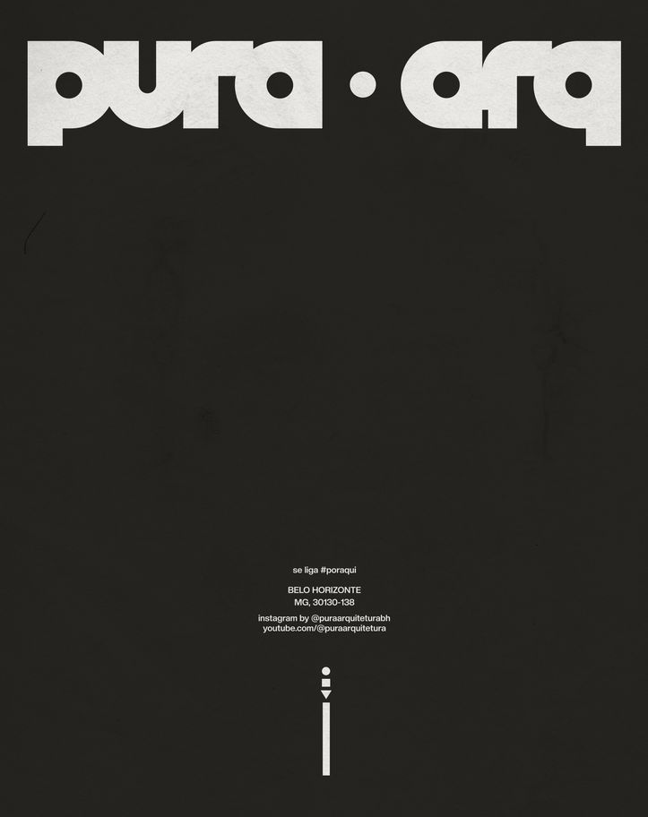
The "pura · arq" logotype is geometric, with generous counterforms and a central separator that organizes reading flow. The circle in the “a” letters and the dot serves as the formal matrix of the system. Solid masses coexist with ample breathing room, reinforcing the balance between form and space.
Graphic System, Typography, and Color Palette
The system uses basic shapes as visual operators that organize hierarchy and navigation, unfolding into grids, modular bars, arrows, and markers for titles, credits, and versions. The typography combines a bold geometric font for titles and signatures with a stable sans-serif for body text, ensuring scale contrast and readability across boards, posts, and dossiers. The palette is anchored in black and white to emphasize formal purity and timelessness, supported by earthy tones and warm grays that connect the brand to materiality while allowing for atmospheric variation without losing identity.
Verbal Tone
Technical, clear, and welcoming. The brand explains the reasoning behind design decisions, facilitates understanding of the process, and highlights the client’s experience at each stage.
Strategic Alignment
The identity supports the proposition of “essential sophistication”: less noise, more substance. The geometric vocabulary communicates precision and mastery, while the generous layouts and contrasts bring proximity and clarity, from print to digital, from posts to video.
[ Type ]
Visual Identity and Motion
[ Year ]
2025
PURA ARQ

![Lotipa_Testes_03-[Recovered].png](https://static.wixstatic.com/media/c054f1_e9d94cfcf048459087daf4e3b3c475b9~mv2.png/v1/fill/w_980,h_227,al_c,q_85,usm_0.66_1.00_0.01,enc_avif,quality_auto/Lotipa_Testes_03-%5BRecuperado%5D.png)


